How to Read Spot Price Charts: A Beginner’s Guide to Technical Analysis
 May, 16 2026
Looking at a screen full of jagged lines and colorful bars can feel like trying to read a foreign language without a dictionary. That is exactly what reading spot price charts is for most new traders. But this visual noise is actually the heartbeat of the market. It tells you where buyers and sellers are fighting, who is winning, and where the price might go next. You do not need a finance degree to understand it. You just need to know what the symbols mean.
This guide breaks down the basics of charting so you can stop guessing and start seeing the story the market is telling. We will cover the different types of charts, how to interpret the data points, and the simple patterns that experienced traders use every day.
The Four Pillars of Chart Data
Every chart, no matter how complex it looks, is built on four simple pieces of information. Traders call this the OHLC framework, which stands for Open, High, Low, and Close. These four numbers capture everything that happened during a specific time period, whether that period is one minute or one month.
- Open: The price at the very start of the time period.
- High: The highest price reached during that period.
- Low: The lowest price reached during that period.
- Close: The final price when the time period ended.
Understanding these four points is crucial because they show the battle between buyers and sellers. If the close is near the high, buyers were in control. If the close is near the low, sellers pushed the price down. This raw data forms the basis of all technical analysis.
Choosing Your Chart Type
You will see three main types of charts online. Each one shows the same OHLC data but presents it differently. Your choice depends on your trading style and how much detail you want to see.
| Chart Type | Visual Style | Best For | Limitations |
|---|---|---|---|
| Line Chart | Single line connecting closing prices | Long-term trends and quick overviews | Hides intraday volatility and range |
| Bar Chart | Vertical lines with left/right ticks | Professional traders needing compact data | Harder to quickly spot sentiment direction |
| Candlestick Chart | Colored rectangular bodies with wicks | Detailed sentiment and pattern recognition | Can be visually cluttered; more false signals in low volume |
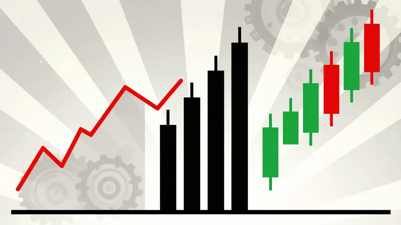
Line charts are the simplest. They only connect the closing prices. This makes them great for seeing the general direction of a market over months or years, but they hide the drama of what happened during the day. Most beginners start here because it is clean and easy to read.
Bar charts give you the full picture in a tight space. The vertical line shows the range from low to high. A small tick on the left marks the open, and a tick on the right marks the close. Professional futures traders often prefer these because they pack a lot of data into a single view without color distractions.
Candlestick charts are the most popular among active traders today. Originating from Japanese rice traders in the 18th century, they use color to make sentiment obvious. A green (or white) body means the price closed higher than it opened-buyers won. A red (or black) body means the price closed lower-sellers won. The thin lines sticking out above and below the body are called "wicks" or "shadows," and they show the extreme highs and lows. Large green candles suggest strong buying pressure, while long upper wicks often mean buyers tried to push the price up but got rejected by sellers.
Timeframes Matter
A chart is not just about price; it is also about time. Every candle or bar represents a specific duration. Choosing the wrong timeframe is one of the biggest mistakes beginners make. A pattern that looks perfect on a 5-minute chart might mean nothing on a daily chart.
Think of timeframes like zoom levels on a map. If you are looking at a 1-minute chart, you are seeing the noise of individual trades. If you look at a weekly chart, you are seeing the big-picture trend. Most successful traders use multiple timeframes together. They might use a daily chart to determine the overall trend, a 4-hour chart to find patterns, and a 15-minute chart to time their entry precisely.
Short-term day traders usually stick to 1-minute, 5-minute, or 15-minute charts. Swing traders, who hold positions for days or weeks, often use 1-hour or daily charts. Long-term investors rarely look at anything smaller than weekly or monthly charts. Matching your timeframe to your strategy keeps you from getting confused by short-term fluctuations that do not affect your larger goal.
Support and Resistance Levels
Two concepts dominate chart reading: support and resistance. These are not magic lines, but psychological price zones where history tends to repeat itself.
Support is a price level where a falling asset tends to stop and bounce back up. Imagine it as a floor. Buyers see the price drop to this level and think, "This is cheap enough for me," so they step in. For a support level to be valid, it usually needs to have been tested at least twice with noticeable bounces.
Resistance is the opposite-a ceiling where rising prices tend to stall and fall. Sellers see the price hit this level and think, "This is expensive enough for me," so they sell. A strong resistance level has been tested multiple times with failed attempts to break through.
When price breaks through resistance, that old resistance often becomes new support. This flip happens because the psychology changes. Buyers who missed the earlier move now see the breakout as a signal to enter, creating a new floor. Identifying these levels helps you decide where to place your buy orders and where to set your stop-losses.
Common Chart Patterns
Prices rarely move in straight lines. They form shapes as buyers and sellers struggle for control. Recognizing these shapes can help you predict what might happen next. Here are three common patterns you will encounter:
- Head and Shoulders: This pattern looks like a head with two shoulders on either side. It usually signals a reversal from an uptrend to a downtrend. The middle peak (the head) is the highest, while the two outer peaks (shoulders) are roughly equal. When the price breaks below the neckline connecting the shoulders, it often indicates a significant drop is coming.
- Double Top: This looks like the letter 'M'. The price tries to break a resistance level twice but fails both times. This failure suggests that buying power is exhausted. If the price drops below the point between the two tops, it confirms the pattern and often leads to a downward move.
- Bullish Engulfing: This is a candlestick pattern found at the bottom of a downtrend. It consists of a small red candle followed by a large green candle that completely "engulfs" the body of the previous one. This sudden surge in buying pressure often signals that the downtrend is over and an uptrend may begin.
Patterns work because they reflect crowd psychology. Fear and greed cause similar behaviors to repeat over and over. However, no pattern is guaranteed. Always look for confirmation, such as increased trading volume, before acting on a pattern.
Volume: The Fuel Behind the Move
Price tells you what happened; volume tells you how strongly it happened. Volume measures the number of shares or tokens traded during a given period. It acts as a fuel gauge for price movements.
If a price breaks through a key resistance level on high volume, it is a strong signal that many people agree with the move. This increases the likelihood that the trend will continue. Conversely, if a price rises but volume is low, it might be a "fakeout." There is not enough participation to sustain the move, and the price could easily reverse.
Always check the volume bars at the bottom of your chart. A spike in volume during a breakout or breakdown adds credibility to the pattern. Without volume confirmation, even the most beautiful chart pattern can fail.
Tools for Charting
You do not need expensive software to read charts. Many free platforms offer powerful tools. TradingView is widely used by retail traders for its intuitive interface and social features. MetaStock is favored by institutional professionals for its depth. Thinkorswim offers robust charting for equity and options traders.
Most modern platforms allow you to draw lines, add indicators like moving averages, and switch between timeframes instantly. Start with a free account and practice drawing support and resistance levels on historical data. The more you look at charts, the easier it becomes to spot patterns naturally.
Practice Makes Perfect
Reading spot price charts is a skill that takes time to develop. Studies suggest it takes around 87 hours of deliberate practice to reliably identify patterns with good accuracy. Do not expect to master it overnight. Start by observing charts without trading. Try to identify trends, support, and resistance on past data. Then, move to paper trading to test your ideas without risking real money.
Remember that technical analysis is not crystal ball gazing. It is probability management. It helps you find setups where the odds are in your favor. Combine chart reading with proper risk management, and you will have a solid foundation for navigating financial markets.
What is a spot price chart?
A spot price chart is a visual representation of an asset's current or historical price over time. It displays data points like open, high, low, and close prices to help traders analyze trends and patterns.
Why are candlestick charts better than line charts?
Candlestick charts provide more detailed information than line charts. They show the open, high, low, and close prices in a single symbol, using color to indicate whether buyers or sellers controlled the session. Line charts only show closing prices, hiding important volatility details.
How do I identify support and resistance levels?
Support levels are price zones where an asset repeatedly stops falling and bounces up. Resistance levels are zones where it repeatedly stops rising and falls back. Look for horizontal areas where the price has touched multiple times in the past.
What does volume tell me in chart analysis?
Volume indicates the strength behind a price move. High volume during a breakout suggests strong conviction and a higher chance of continuation. Low volume during a move may indicate a weak or false signal.
Which timeframe should I use for trading?
It depends on your strategy. Day traders often use 1-minute to 1-hour charts. Swing traders typically use 4-hour or daily charts. Long-term investors focus on weekly or monthly charts. Using multiple timeframes helps confirm trends.