Learn how to read crypto trading charts with candlesticks, volume, and timeframes. Avoid common mistakes and start making smarter trades based on real price action-not guesses.
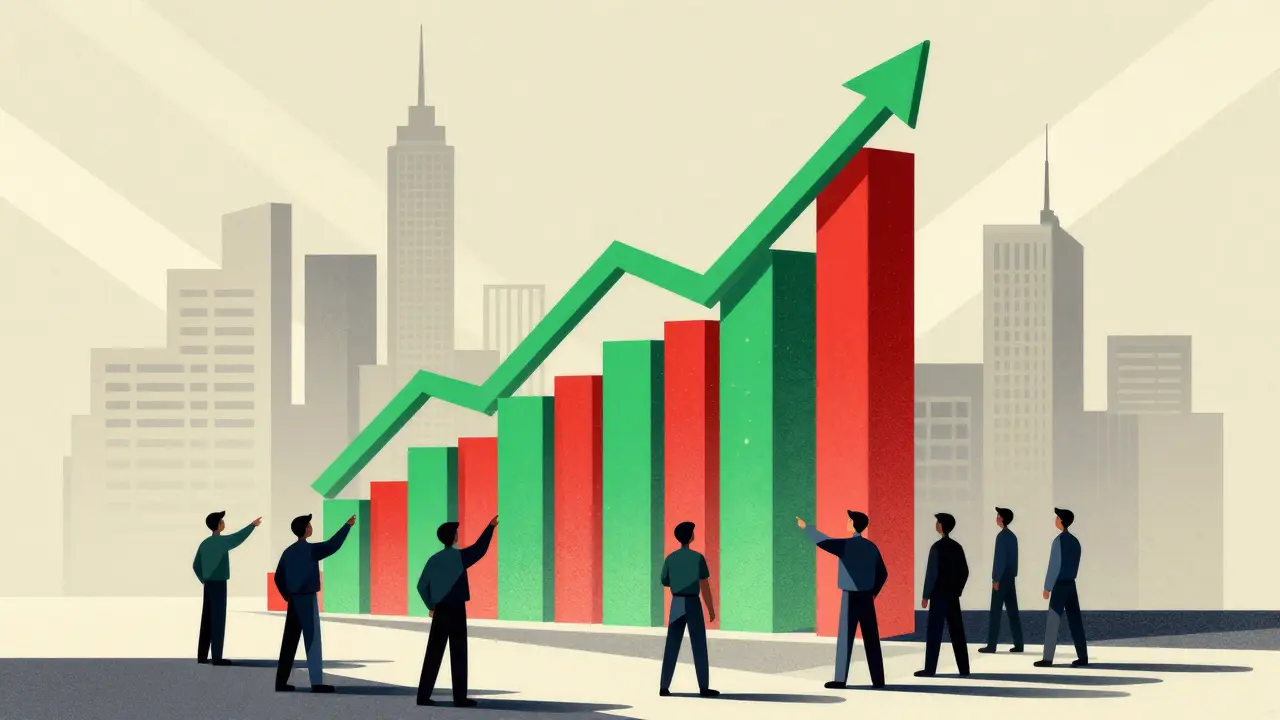
When you look at a crypto price chart, you’re not just seeing lines and bars—you’re seeing candlestick patterns, visual representations of price movement over time, formed by open, high, low, and close values. Also known as price action, these patterns tell you what traders are feeling—fear, greed, hesitation—without a single word. They’re not magic, but they’re real. And in crypto, where prices swing 20% in a day, knowing what a hammer or a shooting star actually means can save you from losing money to fake signals or scams.
Many beginners think candlestick patterns are like horoscopes—look at the shape, guess the future. But that’s not how they work. A bullish engulfing pattern only matters if it shows up after a clear downtrend. A doji means indecision—but only if volume is rising. Most crypto scams rely on people misreading these signals. You’ll see YouTube videos claiming "this pattern means 10x," but those posts rarely mention context: time frame, volume, market sentiment, or whether the coin even has real trading activity. That’s why most of the posts here focus on fake airdrops, dead exchanges, and low-liquidity tokens. They’re not just warnings—they’re lessons in how noise drowns out real signals.
Real traders don’t trade candlesticks alone. They use them with volume, support levels, and market news. For example, if a coin like Mintlayer (ML), a Bitcoin Layer 2 solution enabling native DeFi without wrapping BTC shows a strong bullish engulfing pattern but has zero trading volume, it’s not a signal—it’s a trap. Same goes for meme coins like Cats N Cars (CNC), a token promising supercar giveaways with a 99% price drop and almost no trading activity. The pattern might look perfect, but the market isn’t there. That’s why the best traders check if the coin is listed on real exchanges, if the team is transparent, and if anyone is actually buying.
What you’ll find in this collection isn’t a list of "10 patterns to get rich." It’s a collection of real cases where people got fooled by fake signals, fake exchanges, or fake airdrops that looked like opportunities. Some posts show how scams use fake charts to lure in new traders. Others explain why certain patterns fail in low-liquidity markets. You’ll see how a simple candlestick can be the first sign of a pump-and-dump—or the last warning before a coin dies.
If you’re learning to read charts, start here. Not with a textbook. Not with a bot. With what actually happened—when people lost money, when exchanges vanished, and when the market proved that patterns without context are just pretty shapes on a screen.
Learn how to read crypto trading charts with candlesticks, volume, and timeframes. Avoid common mistakes and start making smarter trades based on real price action-not guesses.